Post #4: New Battle Menu
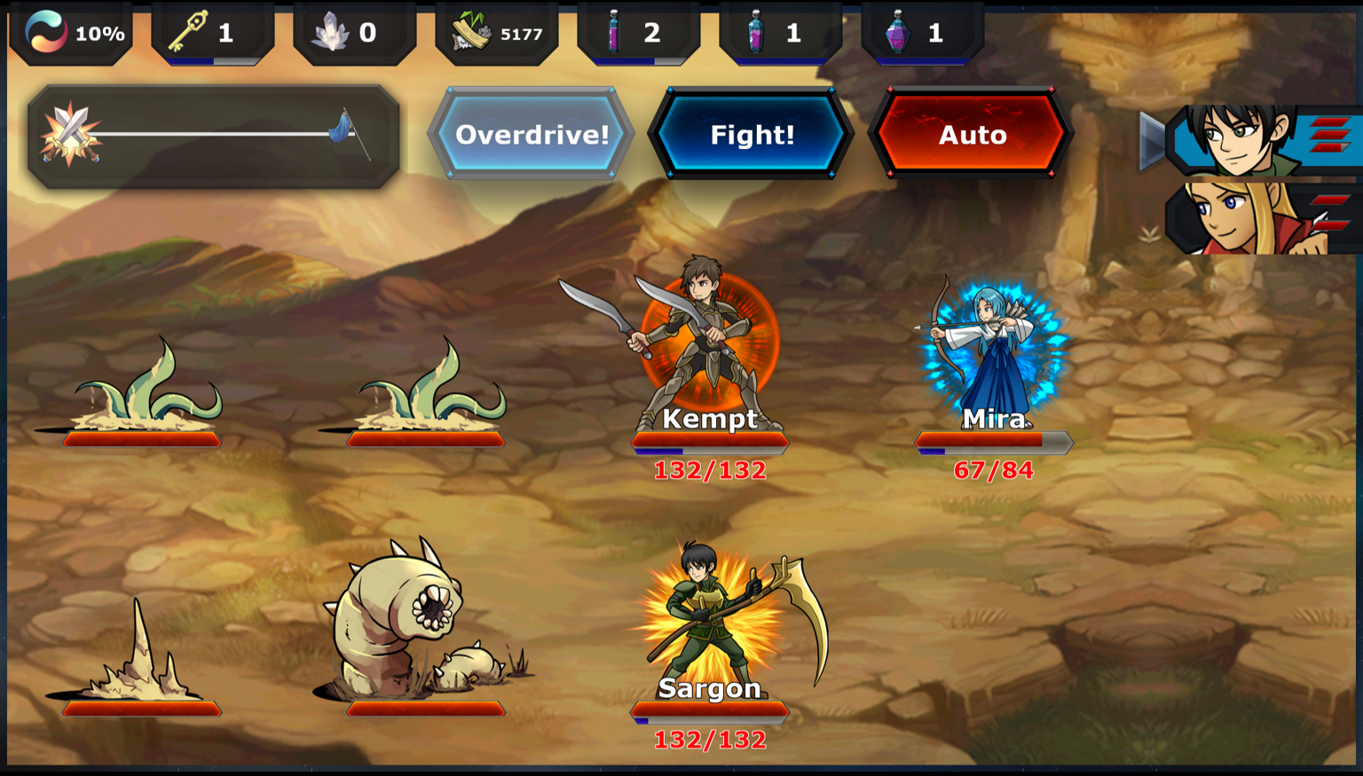
Over the last few days I've been working on improving the layout of the Battle Menu. I wanted to simplify things and make the sprites bigger so they look better on a phone.
Here's what it used to look like - available squads on the right, buttons near the top/middle, progress meter on the left showing how many battles are left, the HUD on top...
BEFORE:
AFTER:

And here's the current draft of the new version. The buttons are along the right side, with the Fight button in the bottom right which is more comfortable on a phone. I ditched the HUD for combat, and in place of the previous battle progress meter I've put in a big health type bar that shows the state of the battle. Currently, this is calculated using the remaining combatants from either side (so like 12 of 70 enemies left versus 8 of 12 player characters left).
You can still go into fiddly detail by swapping squads, changing their tactics, and healing your troops right from the battle menu, and then the gear in the top left lets you change battle speed, volume, etc.
I'm still building it out but I like how it's coming together so far.
Some other quick updates:
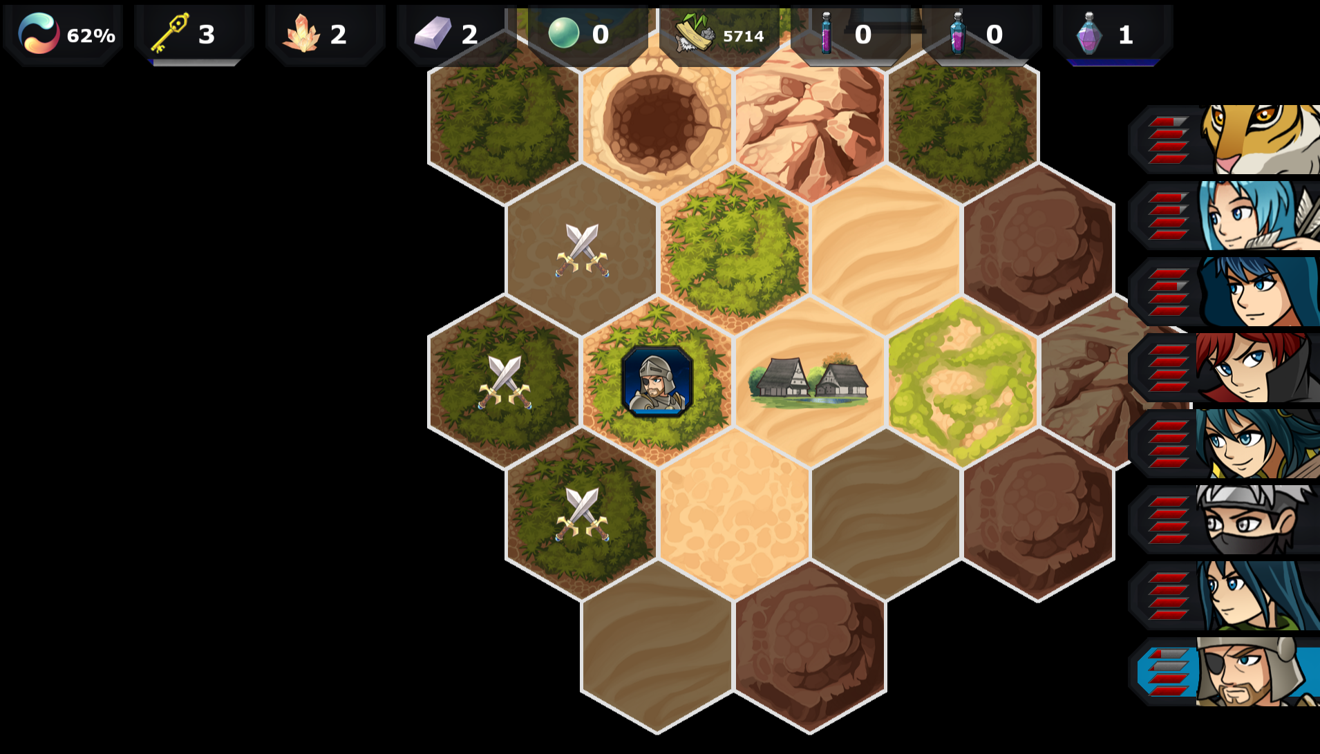
On the maps, I've added borders to the hex tiles and icons to tell you which tiles are available for battles:
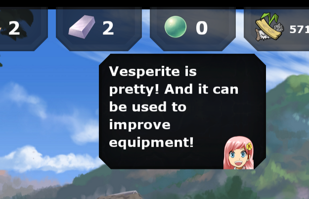
I've added tooltips in a number of places which are delivered by Missive:
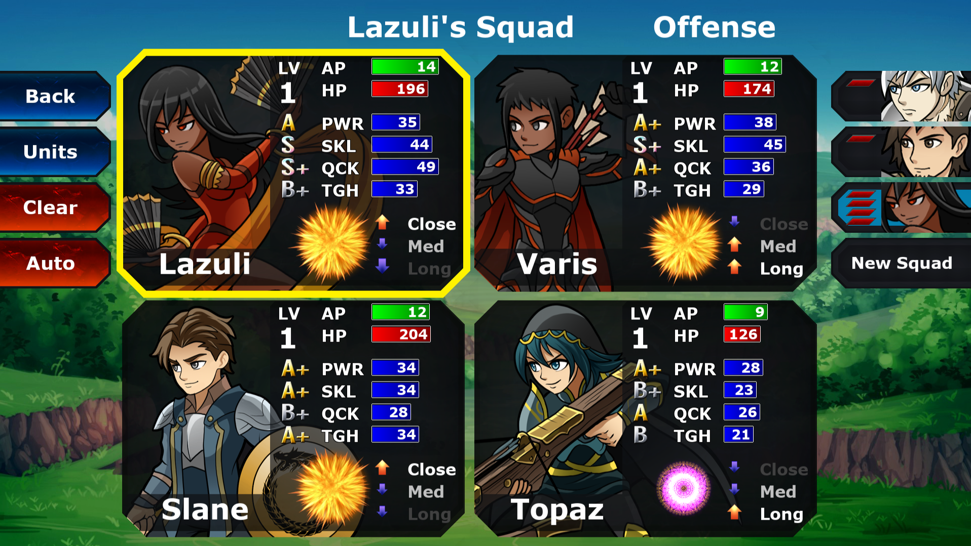
Here's the current look of the Formation menu, still some stuff to work out but it's looking pretty clean and my 7 year old was able to figure it out quickly:
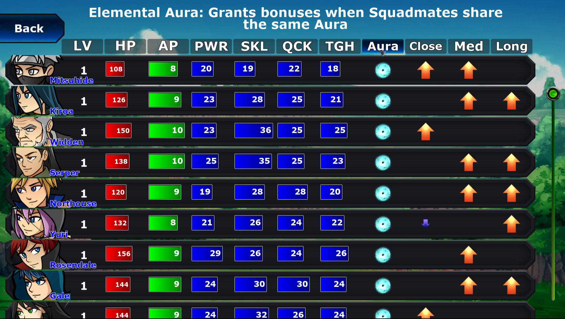
And when you add a character to a Squad, it brings up a sortable/scrollable menu to help you pick who is best for the job:
Stay safe and thank you for your interest!
Get Holdfast Gate
Holdfast Gate
Gacha with a Conscience
| Status | In development |
| Author | Balbary |
| Genre | Role Playing, Strategy |
| Tags | Anime, classical, free, Gacha, grid-based, Hex Based, tactics, Turn-based Strategy |
| Languages | English |
More posts
- Post #9: New Playable Version!May 15, 2022
- Post #8: Pick a Card, Any CardNov 01, 2020
- Post #7: Animation, Summoning, and MoreOct 08, 2020
- Post #6: New Battle System in ActionSep 17, 2020
- Post #5: Resuming Development & Combat OverhaulAug 17, 2020
- Post #3: Formation and RanksMar 29, 2020
- Formation Screen Overhaul w/ High Res ArtMar 20, 2020
- First Post - v0.61 Release and Free DownloadMar 16, 2020

Leave a comment
Log in with itch.io to leave a comment.